Emergency contraception page
Asda Online Doctor
Introduction
Asda Online Doctor (AOD) is an asynchronous online service that lets users request prescription medication without seeing a doctor in person. This includes emergency contraception for women (the morning after pill).
To request medication, users must complete an online ‘consultation’. They can enter the consultation from various points across the website. The service page was the strongest traffic driver according to Google Analytics (GA).
The problem
Looker data showed that the entry rate into the consultation from the service page was low for emergency contraception (EC) compared to other popular services. This was despite the page being a strong traffic driver according to Google Analytics.
Exit rate was also high with low volumes of users navigating to deeper product pages. So we couldn’t say that users wanted to learn more about products before entering the consultation.
Read more the problem and what I learned, below (‘Actions’).
Why this service?
EC was a priority service worth looking at since:
it was popular all year round with a high average order value service
it had a good repeat usage rate, with satisfied users likely to recommend it to others
Plus, Asda was a key partner with the service only being live for a few months at that point.
Hypothesis
By optimising this high traffic page, we could improve entry rate into the consultation.
Plus, we could carry out this work quickly without dev resource since we had CMS control over service pages.
We didn’t have a solid objective goal in mind (e.g. an x% uplift in consultation entry rate). However, based on traffic volume and average order value, an uplift of around 10% would have been viewed favourably.
Actions
I conducted user research to learn more about the service, users’ needs and the problem in order to generate optimisation ideas.
This involved:
talking to our Clinical team to identify common user queries and how the doctors prescribe treatment
talking to the external Asda Clinical team to get a pharmacist’s view of what happens when customers collect their medication in-store
reviewing user feedback via our Customer Support inbox and on-site Hotjar feedback widget, though this didn’t reveal very much in the end
I also looked at two key competitors and did some light touch organic research on the topic.
Two key learnings stood out:
Users often don’t know which product (pill) they need when seeking emergency contraception. This made sense since women use this occasionally (if at all).
Emergency contraception products vary in effectiveness depending on how soon they are used after unprotected sex. This makes timing a key factor when doctors prescribe treatment. For example, product A may be most effective within X hours, whereas product B may be most effective within Y hours.
On the original page, we asked users to ‘choose’ a product in order to enter the consultation (as per clinical regulations). However we did not prominently surface key information to help them understand which product might be right for them to enable them to do this.
With an updated user story and acceptance criteria, I rewrote the intro block content to lead with this key information.
You can see the changes we made below (‘Results’) which included:
adding a user-centric heading (‘Not sure which morning after pill you need?’)
highlighting all the products we offered and when these were most effective so patients could choose based on their own circumstances
adding relevant journeys including links into the consultation for those ready to do request treatment
We wanted to move quickly since Asda was a key partner, the online doctor service was in its early days and emergency contraception was a popular service.
Therefore we:
focused our changes to the intro block content only, as scrollmap data showed a noticeable drop-off after this section
made changes as part of an A/A test, since the website was not set up on our A/B testing platform yet
The user research gave us confidence that we should use this valuable real estate on the page to educate users about which pill they needed. Without this clear guidance, users would need to scroll down to the FAQ section or check each product page to discover the best option for them (and we knew only small volumes did this from heatmap and user journey data). This bolstered our decisions when it came to sign-off.
Results
Entry rate into the consultation increased:
+15% for immediate use contraception
+38% for future use contraception
Exit rate for the page decreased by 40% too with more users entering the consultation or exploring further content (e.g. product pages to learn more about each product).
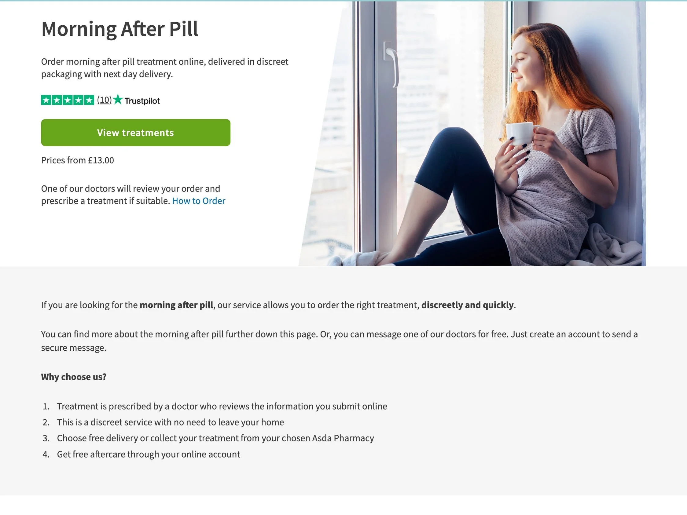
The original emergency contraception page before our changes. Previously the content in this intro block was focused on general service benefits.
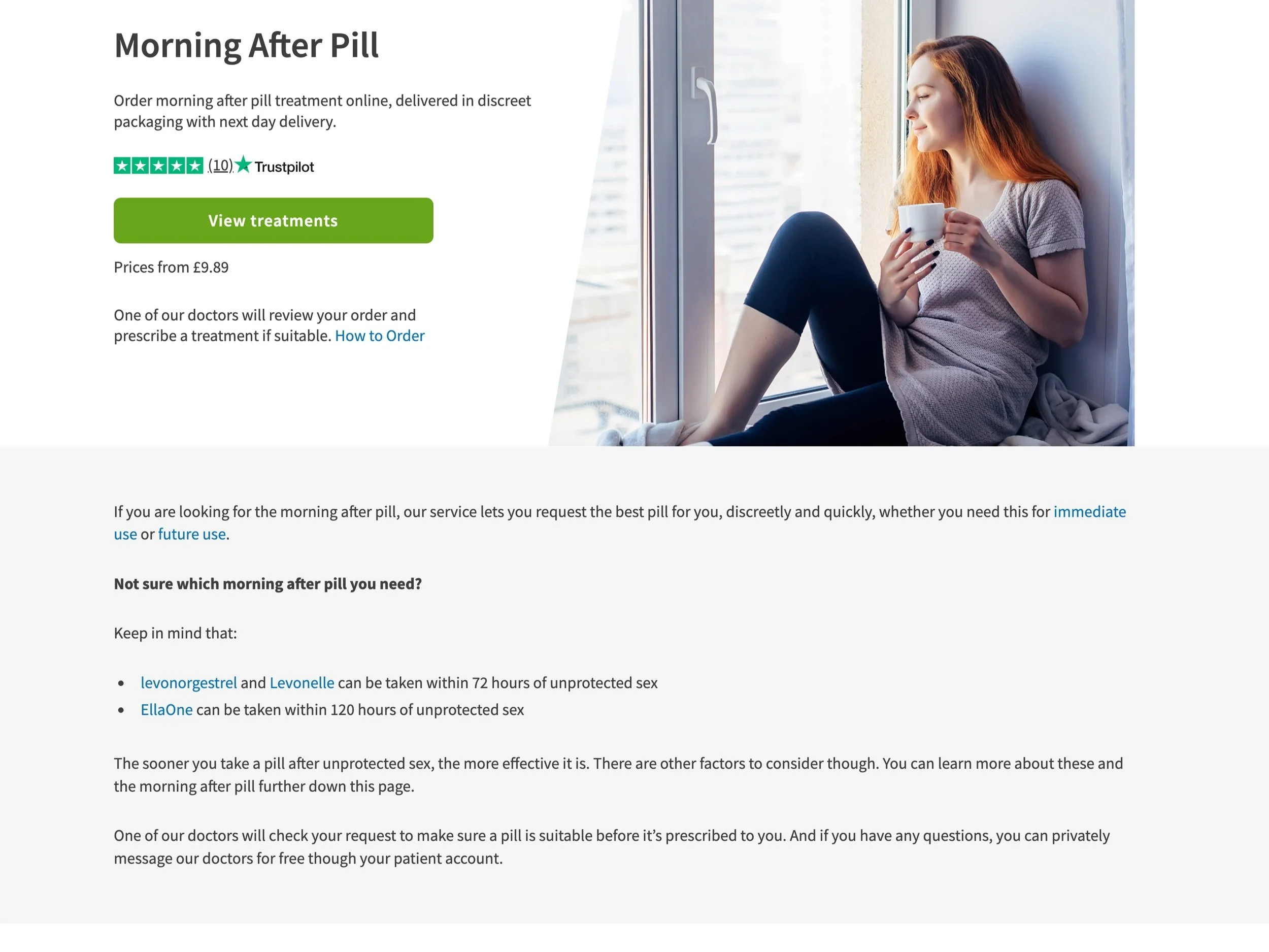
The current emergency contraception page (Oct 2022) following our changes. We updated the content in this intro block to add information that would help guide users into choosing a preferred product.